In today’s data-driven world, organizing information clearly and effectively is crucial. Whether you're presenting data in reports, comparing product features, or tracking project progress, a well-organized table chart helps turn complex information into something easily digestible.
A table chart is defined by Wikipedia as "a graphic representation of data that organizes items in a manner that allows for easy comparison of their features or characteristics." Unlike other types of charts that show trends or distributions, table charts present data side by side, making it easier to compare multiple variables across different categories.
But creating these charts manually can be time-consuming. That’s where table chart makers come in. These tools automate the process, enabling you to generate professional-looking tables quickly and efficiently, while offering customization options that make your charts both functional and visually appealing.
In this blog, we’ll explore the importance of table chart makers, how to use them effectively, and highlight some of the best free options available. Whether you're a business professional, educator, or content creator, these tools can help you streamline your workflow and present data in the most effective way possible.
Table of Contents
- The Importance of Table Chart Maker
- How to Use a Table Chart Maker Today
- 10 Free Table Chart Makers You Should Try
- Use Cases for Table Chart Makers
The Importance of Table Chart Maker
In today’s fast-paced world, data is everywhere. Without the right tools, it’s often difficult to make sense of it all. Table chart makers provide an efficient way to organize, present, and compare complex data, turning raw figures into something visually accessible and easier to analyze.
- Streamlining Complex Data
A table chart maker helps organize large sets of data into neat, structured rows and columns, making it easier to compare and contrast different variables. Whether it’s pricing options, product specifications, or survey results, having a clear layout allows for quicker insights and more informed decision-making.

- Enhancing Efficiency
Instead of manually entering and formatting data, a table chart maker automates much of the work, saving valuable time. These tools can import data directly from other sources (such as spreadsheets or CSV files), allowing you to focus on analyzing the information rather than organizing it.

- Enhancing Accuracy and Clarity
By eliminating the manual entry process, table chart makers help reduce errors and increase the clarity of your data. With features like sorting, filtering, and customizable designs, these tools make it easier to present information in an organized, readable way.
- Providing Customization and Flexibility
Every dataset is unique, and a one-size-fits-all solution doesn’t always work. Table chart makers provide flexibility, allowing you to adjust the layout, customize columns, and highlight key data points.
- Supporting Collaboration
Modern table chart tools make it simple to share your work with others. Whether you’re exporting the chart as a PDF or collaborating in real-time, these tools enable seamless sharing and ensure everyone is on the same page.

In today's AI-driven world, the role of table chart makers has evolved, becoming more intelligent and efficient than ever. These tools now leverage advanced technology to automate data entry, improve accuracy, and enhance customization, allowing them to better fulfill their purpose of organizing and visualizing complex data with ease.
How to Use a Table Chart Maker Today
With advancements in AI technology, creating a table chart today has become faster, easier, and more intuitive. Thanks to AI-driven table chart makers, you can now generate professional-looking charts with minimal effort, and even automate parts of the process that were once time-consuming. Here’s how you can start using a table chart maker today:
1.Input Your Data
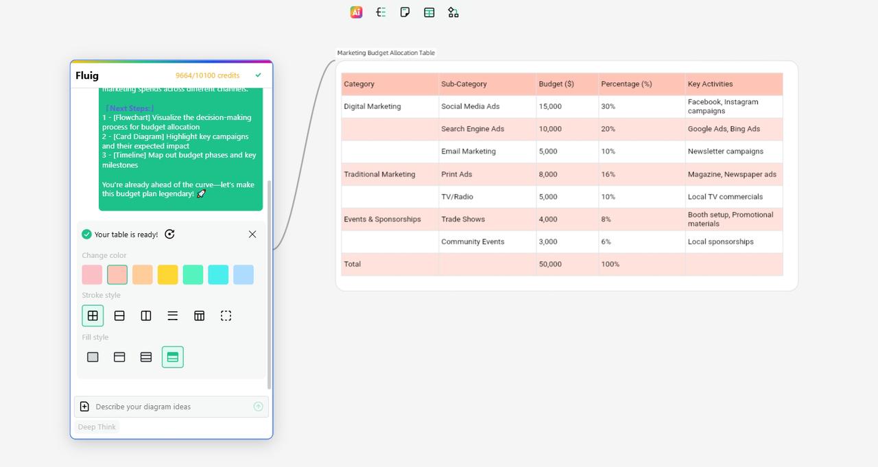
The first step is to input the data you want to display in your table chart. Traditional methods often required manually entering each piece of data into rows and columns, which could be both tedious and error-prone. However, with modern AI-powered tools like Fluig, you can simply describe your data or upload a document or file for conversion. It will show you a perfect table chart there. For example, you can type something like, “Create a table chart for allocating the marketing budget.” AI tools will automatically process this input and generate a structured table with the relevant data. This step dramatically reduces the time spent organizing and formatting data.

2.Customize the Chart
Once your table is generated, you can customize it to fit your needs. AI-powered tools give you flexibility in adjusting the table’s appearance, allowing you to:
- Change the layout: Modify how rows and columns are organized, add or remove categories, or even merge cells for clarity.
- Highlight key data: Use colors, fonts, or icons to emphasize the most important elements or differences within your table.
- Adjust design elements: Choose from various themes, fonts, and styles to match your desired visual aesthetic.
Customization features are especially useful for tailoring the chart to specific contexts, such as making it more professional for a report or more engaging for a presentation.
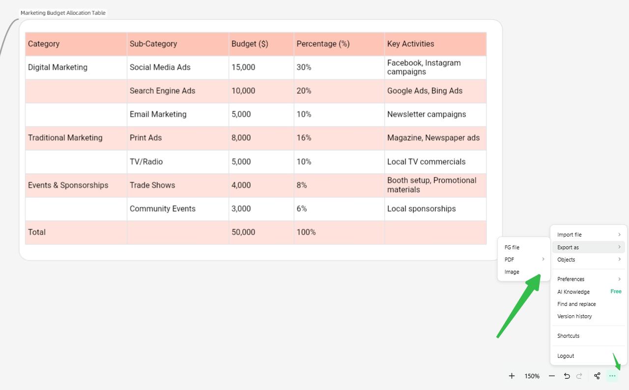
3.Export Your Chart
Once your table is finalized, the next step is to export and share it. Modern table chart makers allow you to convert your chart into various formats, such as:
- PDF: Perfect for printing or sharing in a non-editable format.
- PNG/JPEG: Ideal for including in presentations, websites, or social media posts.
- Excel/CSV: If you need to further analyze or share your data with others, you can export the table to a spreadsheet for continued work.
AI-powered tools also allow you to easily embed the table directly into websites or share it via a simple link, making collaboration and sharing smoother than ever.
With these simple steps, AI-powered table chart makers have truly transformed how we create and customize data visualizations. From easy input methods to seamless exports and sharing, these tools make the process quick, intuitive, and efficient. Now that you understand how easy it is to create a table chart, let’s explore 10 free table chart makers that can help you get started.
10 Free Table Chart Makers You Should Try
Creating table charts has become a lot easier thanks to the wide variety of tools available today. Whether you need something quick and simple or a more advanced, AI-driven solution, these tools can help you turn raw data into organized and visually appealing tables. Here are 10 free table chart makers that can help you get started.
Fluig revolutionizes the table chart creation process with its AI-driven technology. Rather than spending time manually entering data into rows and columns, you can simply describe what you want, and Fluig will automatically generate a structured table chart for you. Whether you're comparing products, services, or summarizing features, Fluig’s AI can quickly process your input and present the data in a clear, organized format.
Additionally, Fluig supports the conversion of other file formats into table charts, so you can seamlessly upload documents and transform them into editable tables. Once the table is generated, you can customize the layout and design to suit your needs, whether for a report, presentation, or collaboration with your team.

Google Sheets is a powerful, cloud-based tool that remains one of the most popular for organizing data. It provides a versatile, user-friendly platform to create and format table charts. Users can input their data manually or import it from external sources like CSV files, and then use built-in features to sort, filter, and organize the data in a table format.

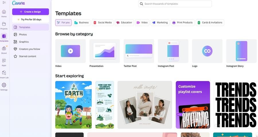
Canva, primarily known for its design capabilities, also offers table chart templates that allow for easy customization. While it’s not as focused on data management as other tools, Canva’s drag-and-drop interface lets users create visually appealing table charts with ease.
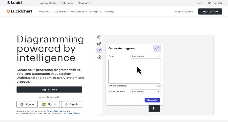
Lucidchart is a versatile diagramming tool that can also be used to create table charts. Known for its collaboration features, Lucidchart allows multiple users to work on the same chart simultaneously. While it's primarily used for creating flowcharts and diagrams, Lucidchart’s table chart feature provides an effective way to organize data and compare different elements side by side.
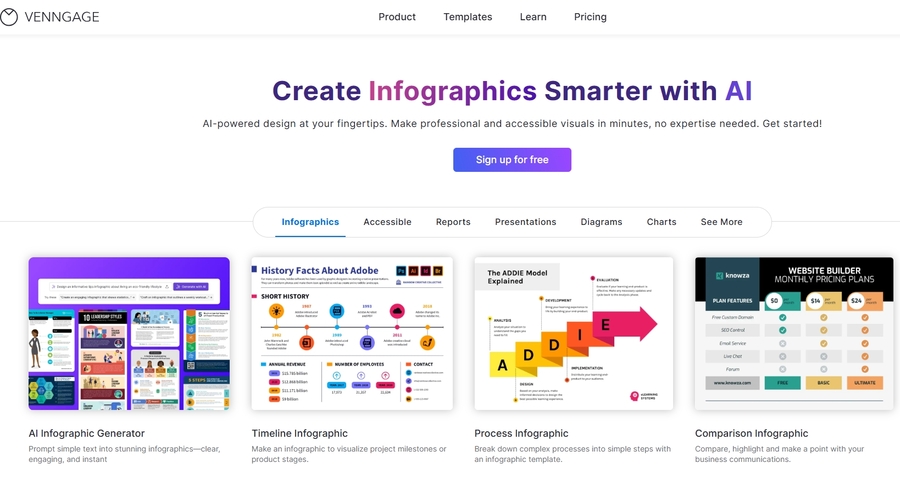
Venngage is an online infographic maker that also provides templates for creating table charts. It’s great for users who need to present data in a more creative and visually appealing way. While it’s similar to Canva in terms of design, Venngage also offers customizable charts and tables that can be tailored for presentations, reports, or marketing purposes.
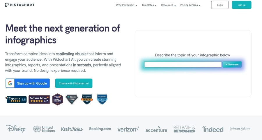
Piktochart is known for its ability to create interactive charts and infographics, including tables. With its easy-to-use editor, you can quickly design and customize table charts for a range of applications, from reports to business presentations.
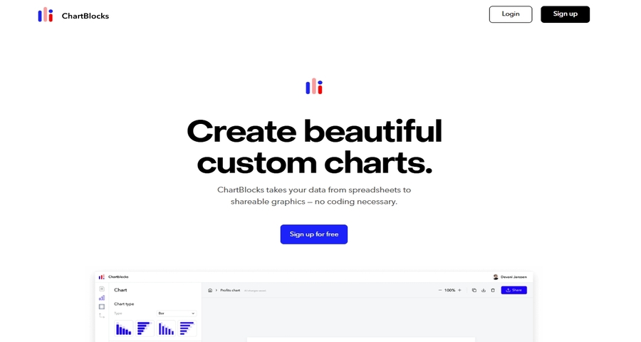
ChartBlocks is a simple and effective tool for creating table charts. You can manually enter data or import it from CSV files, and the tool will generate a clean, structured chart. ChartBlocks is a great option for those who need a straightforward solution for quickly generating basic table charts.
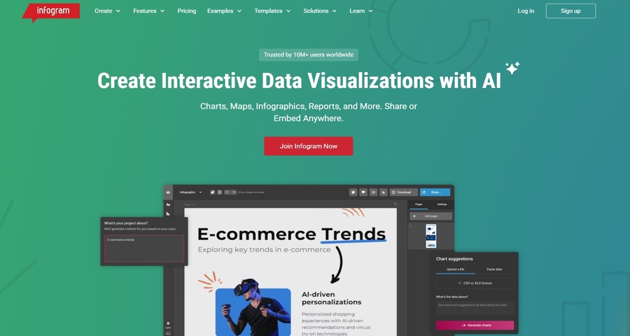
Infogram is a powerful tool for creating interactive charts and infographics, including table charts. It’s ideal for users who want to engage their audience with dynamic data presentations. Infogram allows you to easily drag and drop data, customize designs, and share your charts online.
Mind the Graph specializes in creating professional-grade scientific diagrams, but it also offers templates for creating table charts. It’s perfect for academics and researchers who need to present complex data in a clear, visual format. It's more aimed at academic researchers.

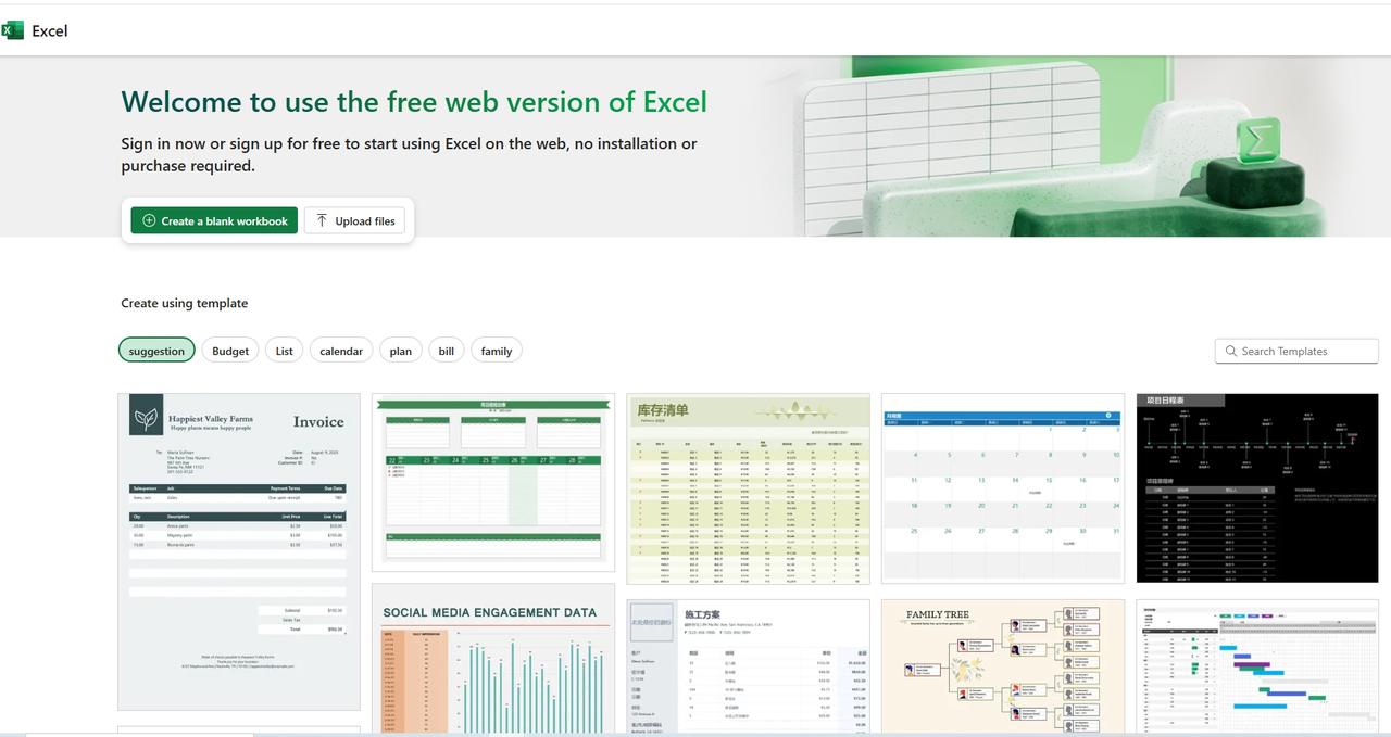
Excel has long been a go-to tool for data analysis, and its online version allows for easy collaboration and access from anywhere. With its advanced formula capabilities and data organization features, Excel Online is ideal for users who need more control over data manipulation while creating their table charts.
These 10 free table chart makers provide a range of solutions to fit different needs, from simple data organization to AI-powered, customizable chart generation. Whether you're looking for a quick way to create basic tables or a more advanced tool to help automate the process, these tools will help you visualize your data in a clear and structured way.
Use Cases for Table Chart Makers
Table charts are incredibly versatile and can be used across many different industries and scenarios. They allow users to clearly organize and compare data, making them an essential tool in data analysis, business management, education, and beyond. Let’s explore some of the common use cases for table chart makers, highlighting how these tools can improve decision-making and efficiency.

- Product Comparisons
When you’re comparing multiple products, whether in terms of features, pricing, or performance, table charts offer a clear and structured way to visualize the differences. Traditional methods might require hours of manually sorting data, but table chart makers simplify this by automatically generating a comparison table.
- Financial Reporting
For accountants, financial analysts, or business owners, table charts are invaluable in presenting financial data such as balance sheets, income statements, and expense reports. By organizing numbers into rows and columns, table charts provide a more intuitive view of financial data compared to raw figures.
- Project Management
Project managers use table charts to track tasks, timelines, and milestones, keeping teams organized and on schedule. A table chart can display task assignments, deadlines, and statuses in a way that’s easy for everyone to understand.
- Academic Data Organization
In education and research, table charts are commonly used to organize data like student grades, research data, and study schedules. They help educators and researchers compare results, track progress, and summarize findings in a clear, easy-to-read format.
- Market Research and Consumer Surveys
Market researchers rely on table charts to summarize and compare consumer preferences, survey results, and other market data. Having the ability to quickly generate comparison tables from survey responses or consumer feedback allows researchers to identify trends and draw insights without getting bogged down by data entry.
- Inventory Management
For businesses managing inventory, table charts are essential for keeping track of stock levels, product descriptions, prices, and reorder information. Table charts provide a simple and effective way to monitor inventory and make data-driven decisions about restocking or pricing adjustments.
There are countless other scenarios where these tools can make a significant impact. From tracking performance metrics to comparing research data, table charts are invaluable in a wide range of industries and tasks.Mastering a table chart maker, especially one that’s as intuitive and intelligent as Fluig, is essential for anyone looking to streamline their data organization and decision-making process.
Conclusion
Thanks to advancements in AI technology, tools like Fluig have revolutionized the process of creating table charts. These tools not only simplify the creation of tables by using natural language inputs but also offer the flexibility to convert data from various file formats, making it a powerful and time-saving solution for professionals across industries. By using the right tools, you can unlock the full potential of your data, enhance collaboration, and boost productivity.
FAQ
1.What is a table chart maker?
A table chart maker is a tool that helps you organize data into a structured table format, making it easier to compare and analyze multiple variables. It automates the process of creating tables, saving time and reducing the chances of errors in data entry.
2.How does Fluig differ from other table chart makers?
Instead of manually entering data, you can simply describe what you want, and Fluig automatically generates a table for you. It also allows for easy conversion of data from other formats into table charts, and offers customization options to suit your specific needs, making the entire process faster and more intuitive.
3.Can I use a table chart maker for free in Fluig?
Yes, Fluig offers free versionss. You can use it to generate your preferred table chart there.
4.How do I convert data into table charts with Fluig?
Fluig makes it easy to convert data from different sources into table charts. You can upload a document or file (such as a Excel file, or text document) into Fluig, and it will automatically process the data and generate a table chart. Additionally, Fluig allows you to input data directly by typing it into the platform, and the AI will structure it into a table for you.
5.Can I customize the table chart created by Fluig?
Yes, Fluig offers a variety of customization options for your table charts. After Fluig generates the table, you can modify the layout, adjust column widths, add or remove columns, change fonts, colors, and more.
6.Can I convert a table chart into other types of charts in Fluig?
Absolutely! Fluig allows you to convert your table chart into different types of charts like bar charts, line graphs, and pie charts. This gives you the flexibility to visualize your data in various formats based on your needs, whether for reporting, analysis, or presentations.
7.How do I share or export my table chart created with Fluig?
Once your table chart is ready, Fluig allows you to export it in various formats, such as PDF, PNG, or Excel.